Project. Easy Flora
Client. Easy Flora
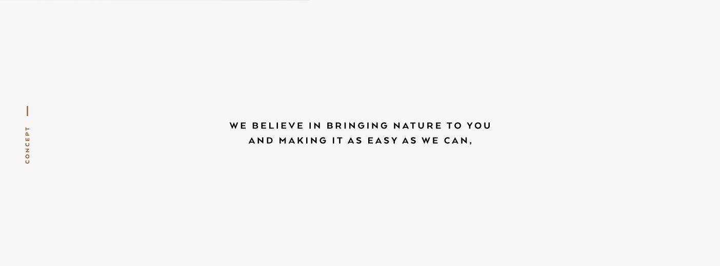
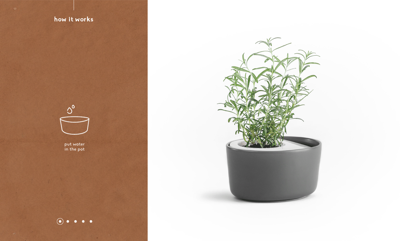
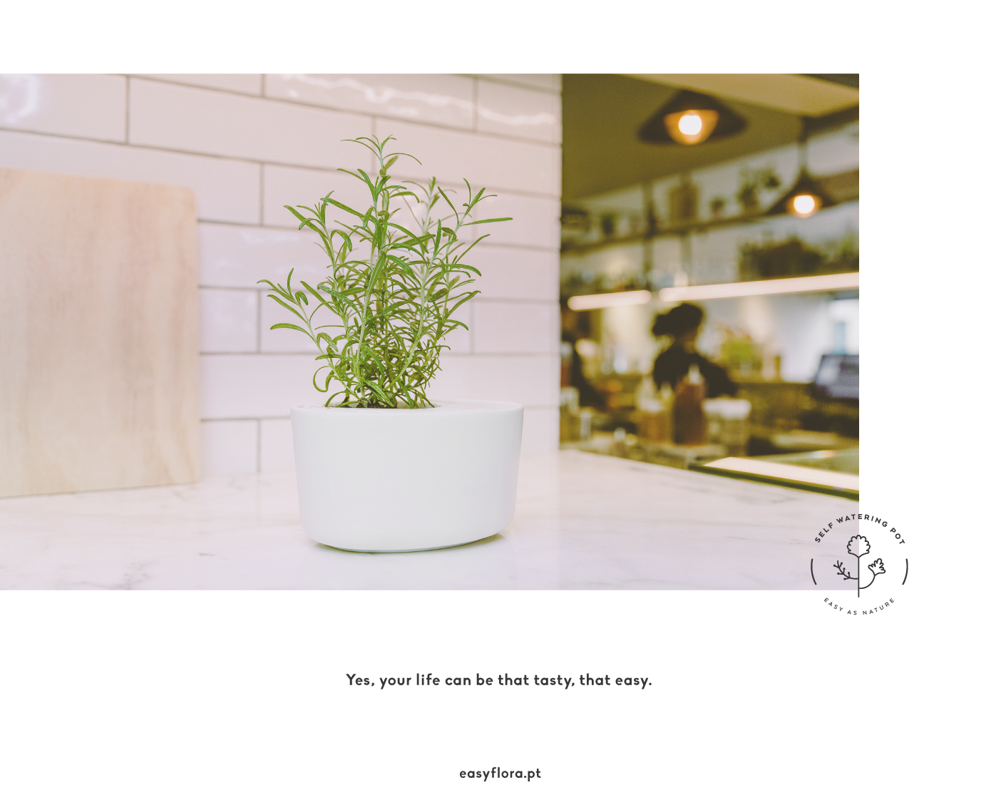
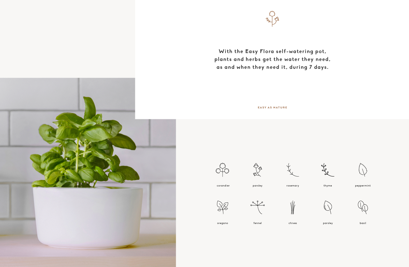
With the Easy Flora self-watering pot, plantas and herbs get the water they need, as and when they need it.
Identity + Editorial + Packaging + Website
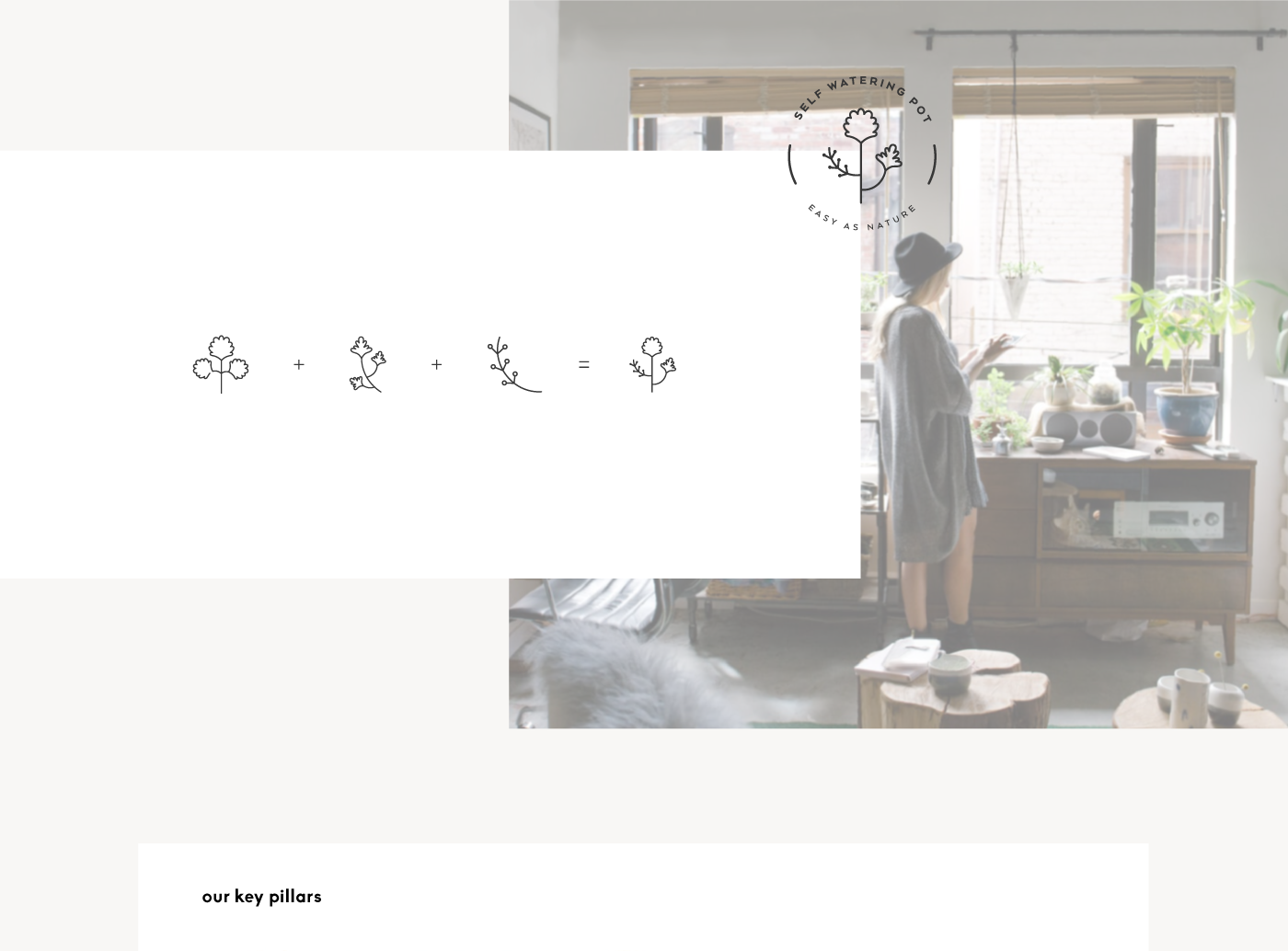
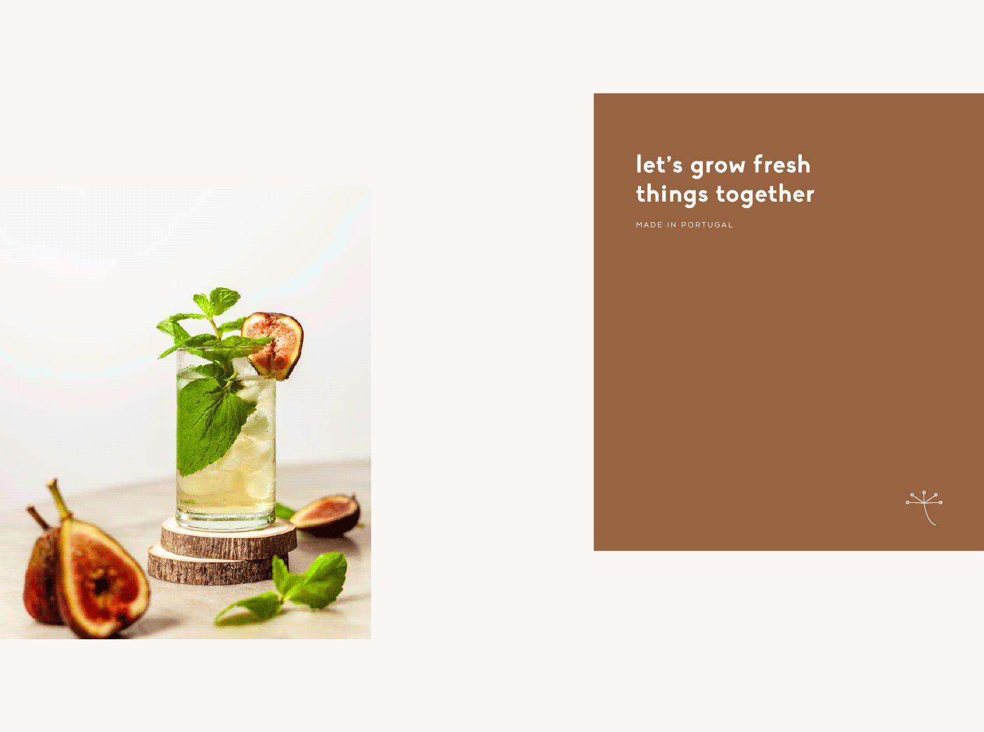
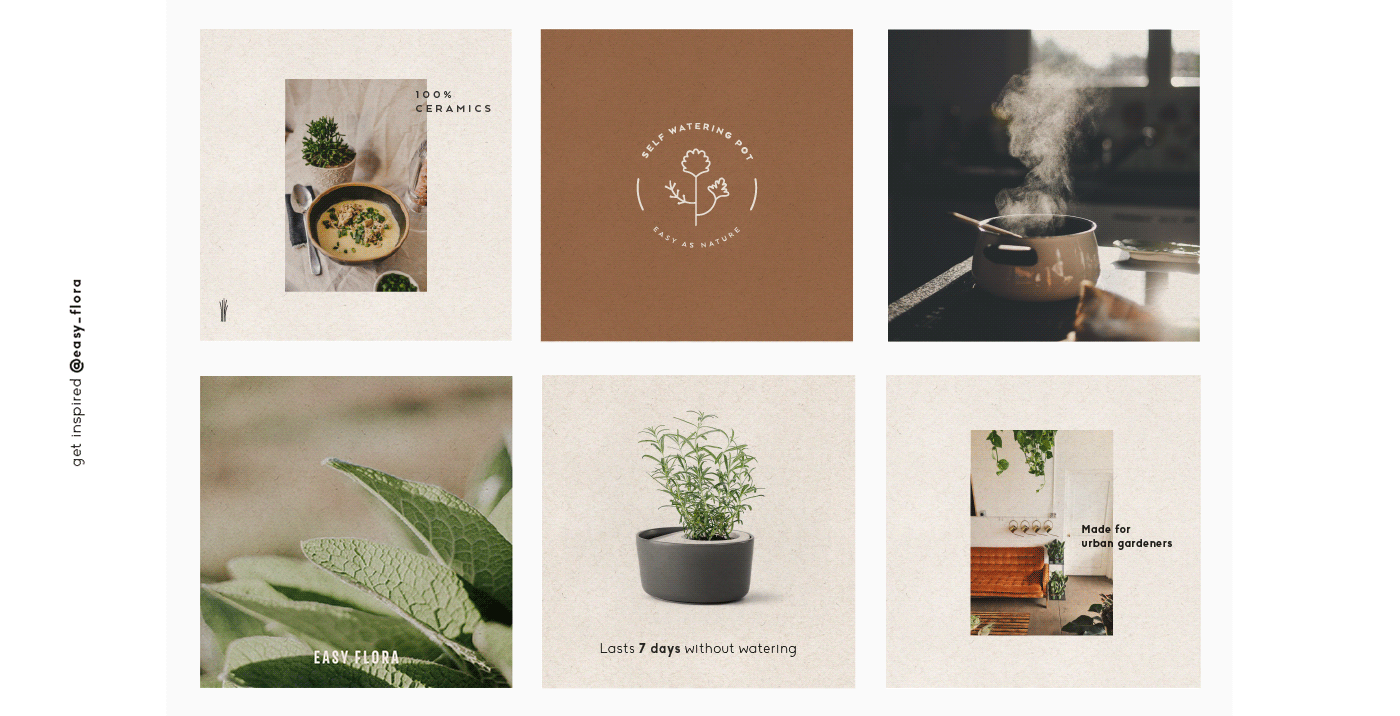
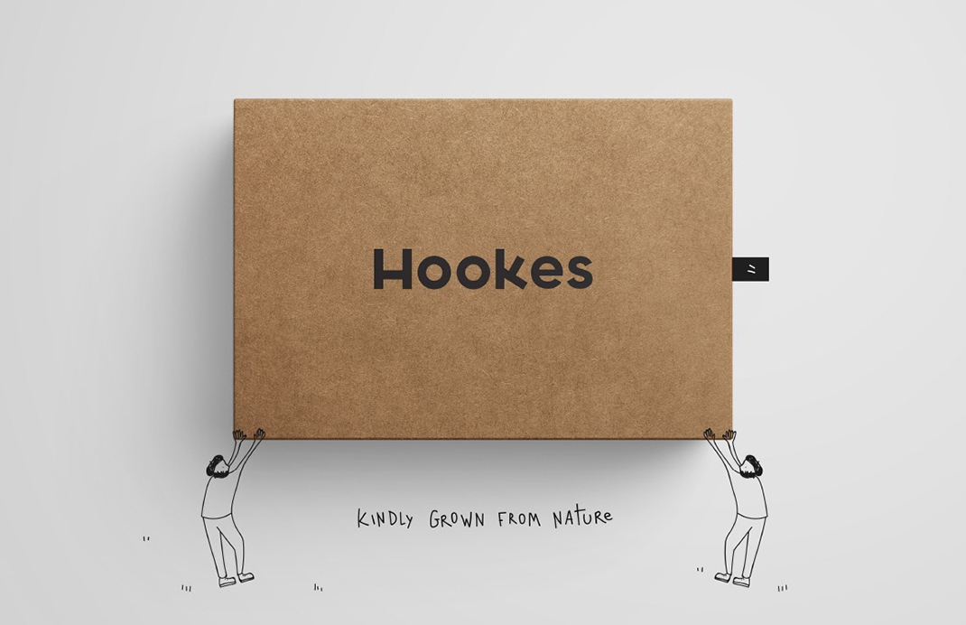
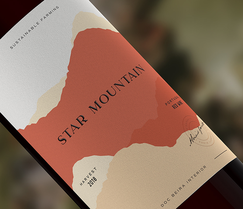
The first step into our creative approach was to develop a brand identity that would convey the lightness vs. roughness, the ethereal vs. tangible of the product. We wanted to bring a twofold identity to life that would showcase both the rough and the elegant — a sort of parallelism between the logotype, the wordmark and the tagline we developed and the product materials and the cleanliness of its end purpose. The colour palette also unveils a mirroring system between the prevailing dark grey/black followed by the secondary terracotta/beige/ecru undertones.
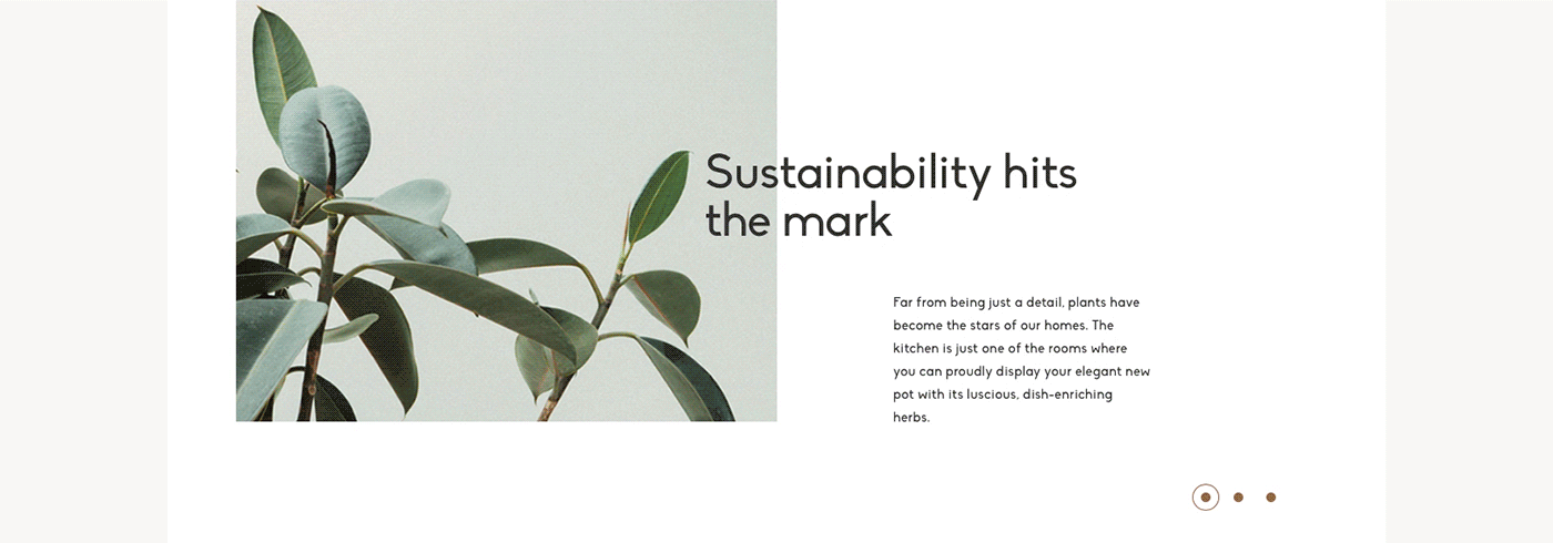
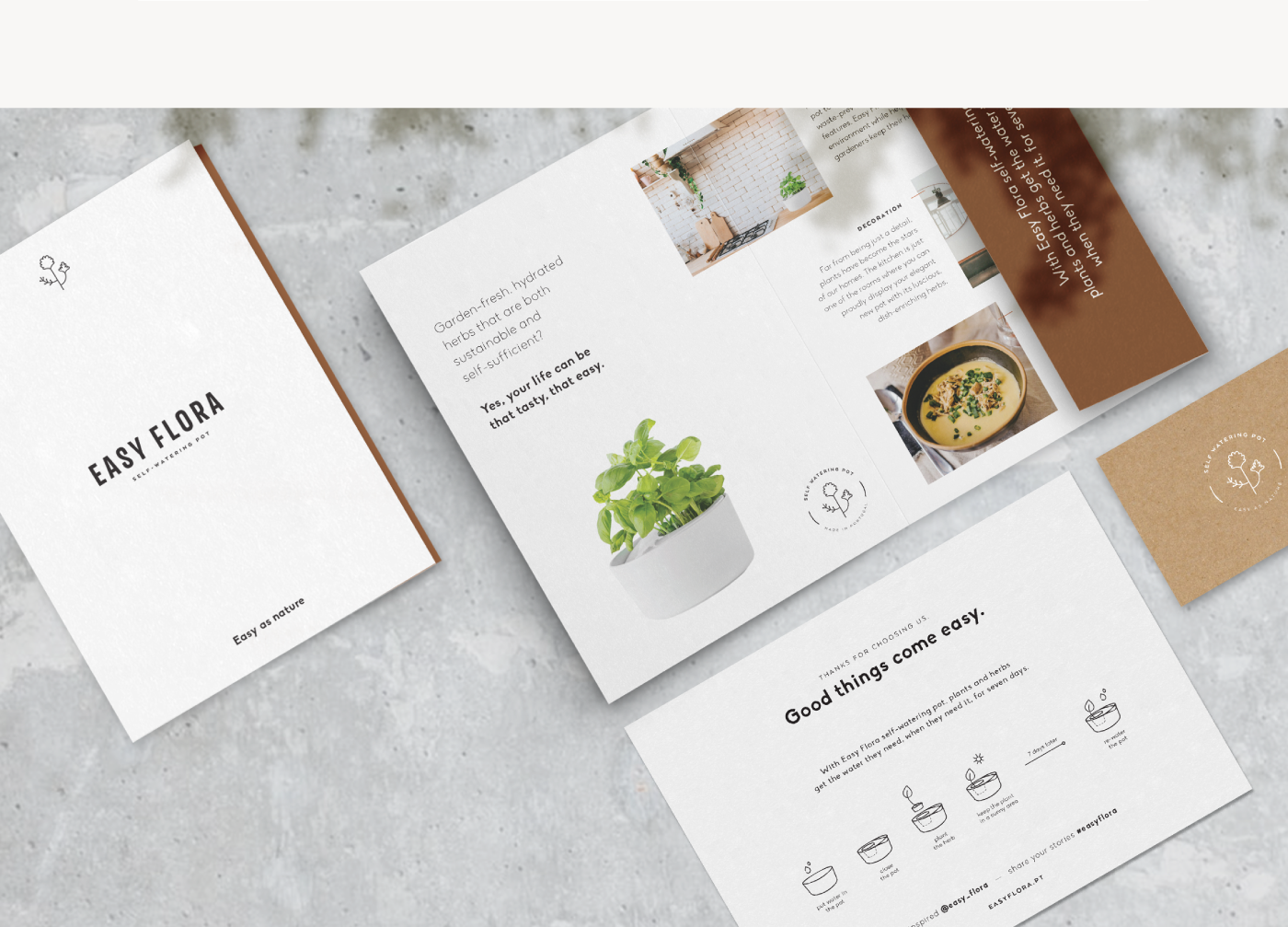
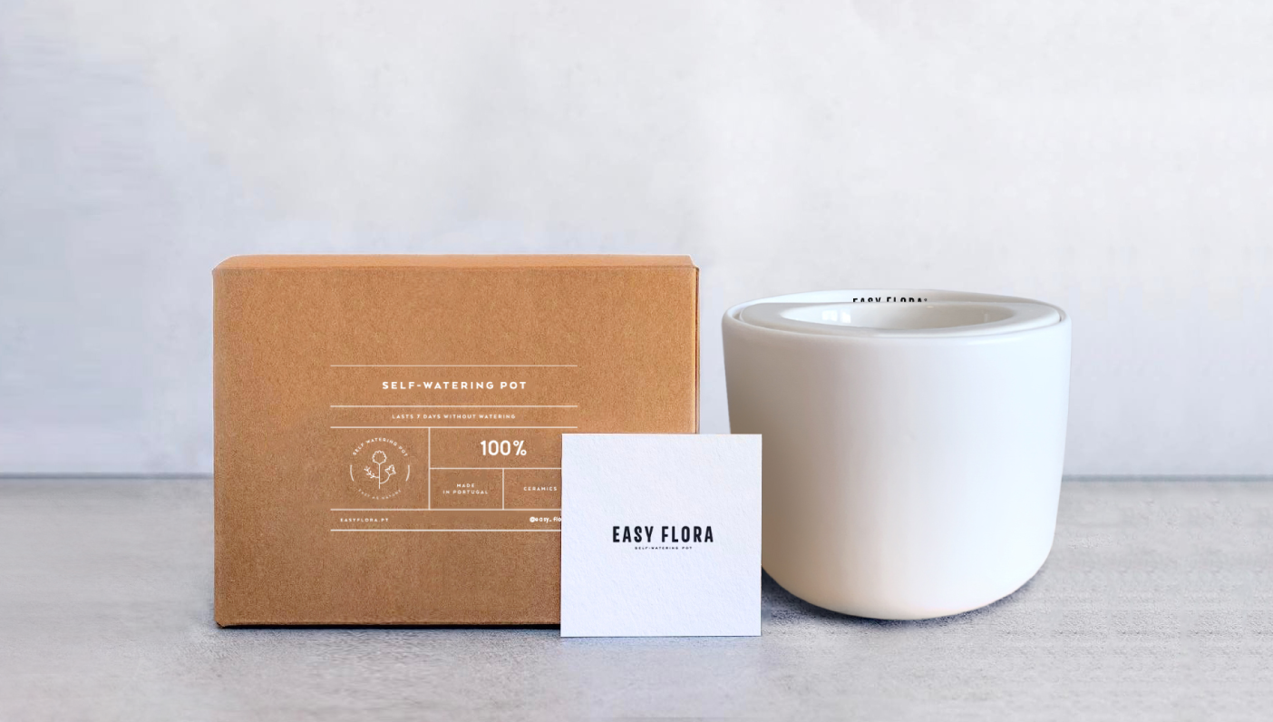
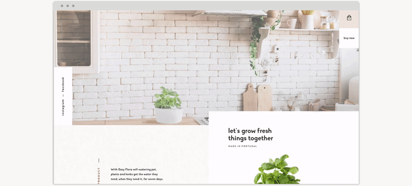
The visual identity and structure is transversal and readable throughout the branding, from the look and feel of the brand identity to the brand voice, as well as the carefully designed packaging — including the materials used (screen printing on craft paper) and the recycled paper for the communication materials — and the custom e-commerce website created from scratch alongside the branding.