Project. Le Petit Camion
Client. Le Petit Camion
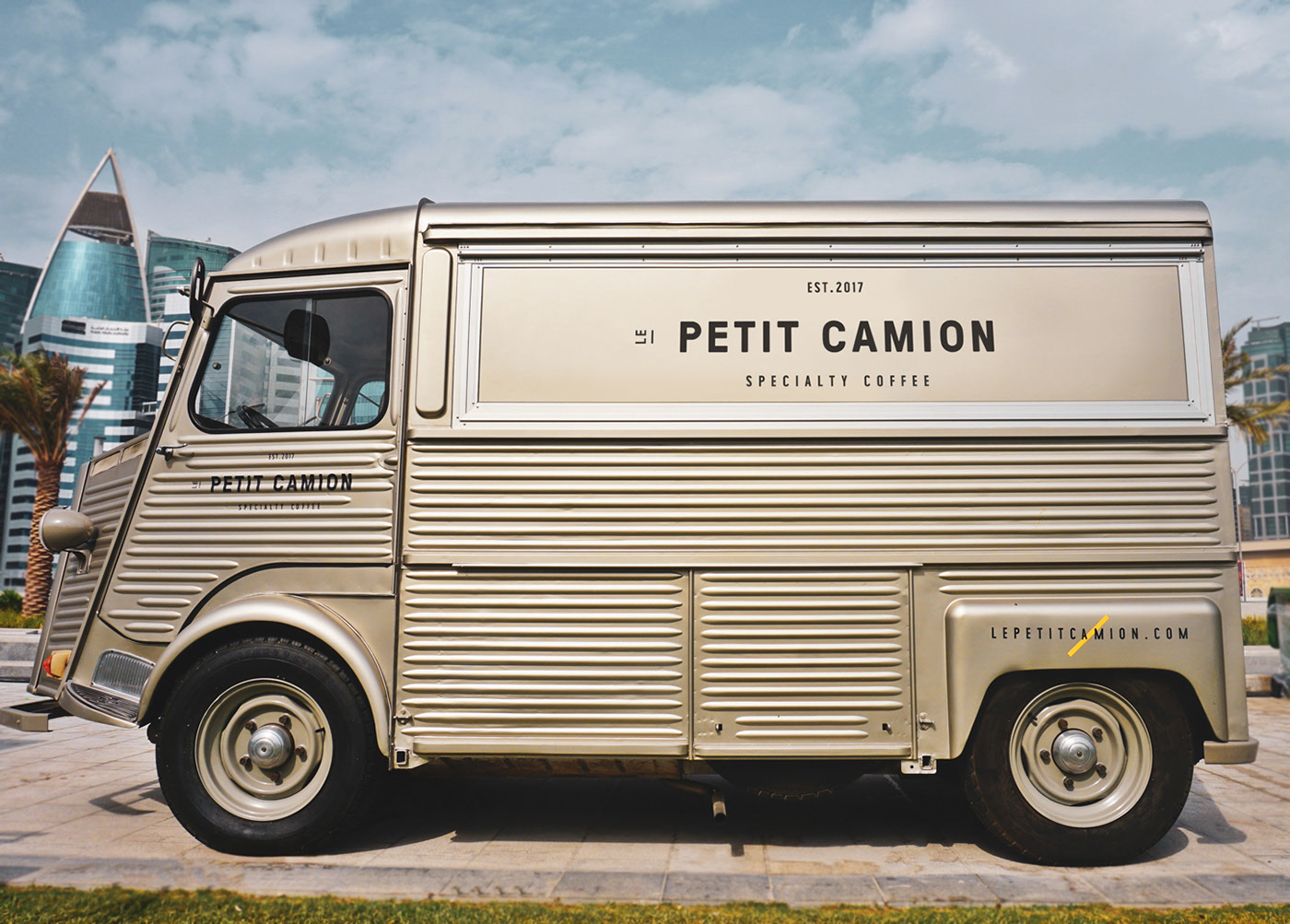
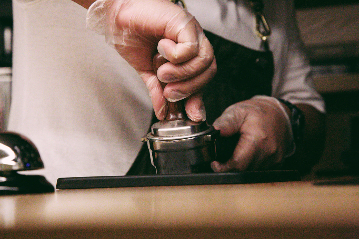
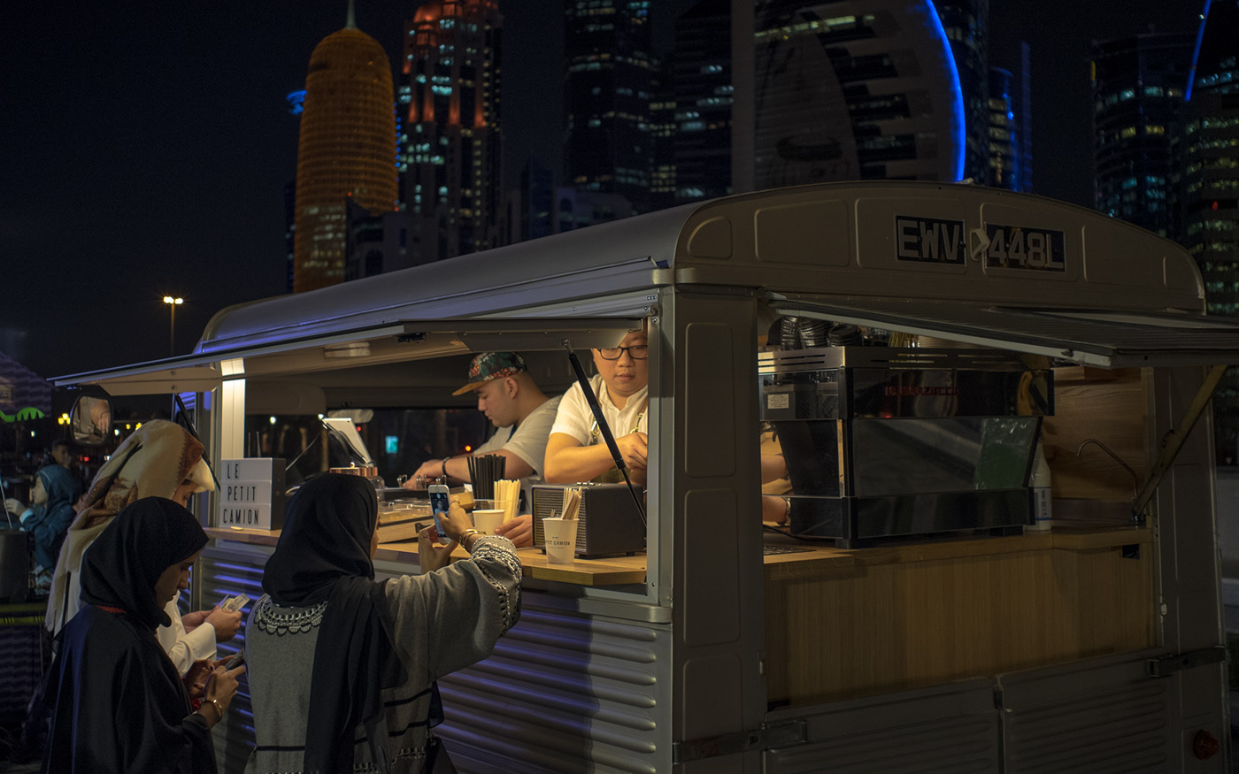
A Citroen H van coffee truck who came to impress coffee lovers market.
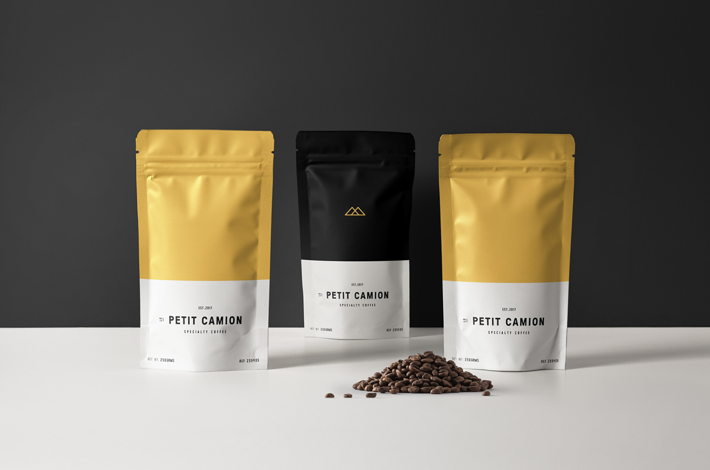
Identity + Packaging + Digital
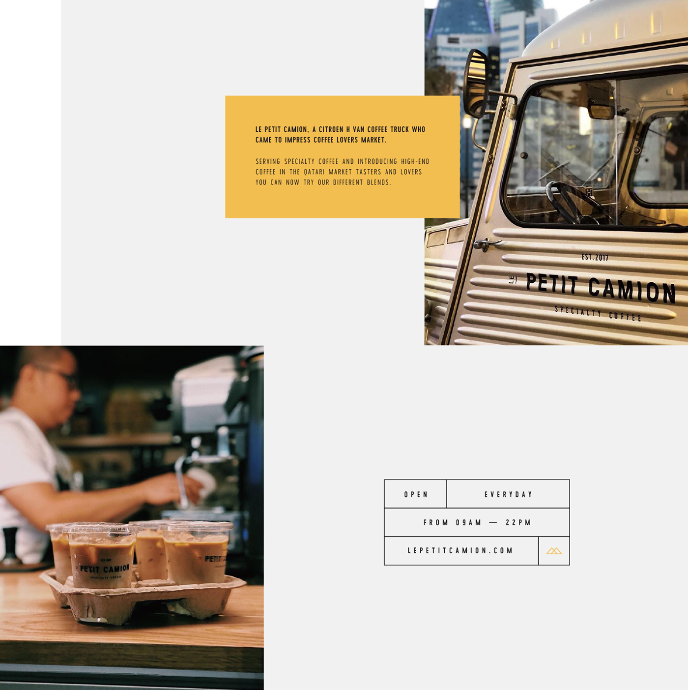
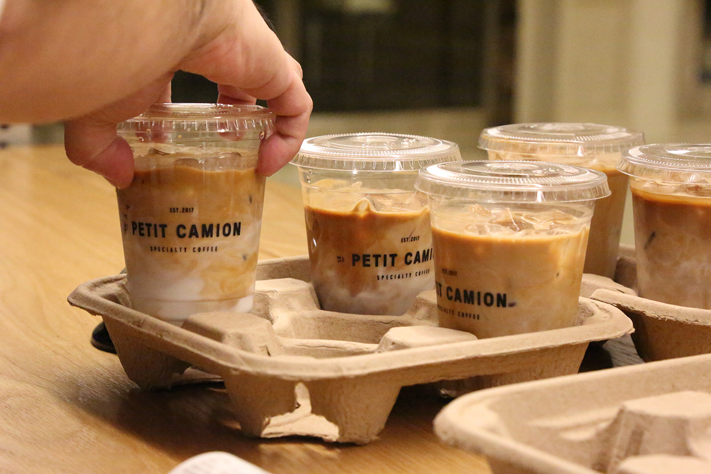
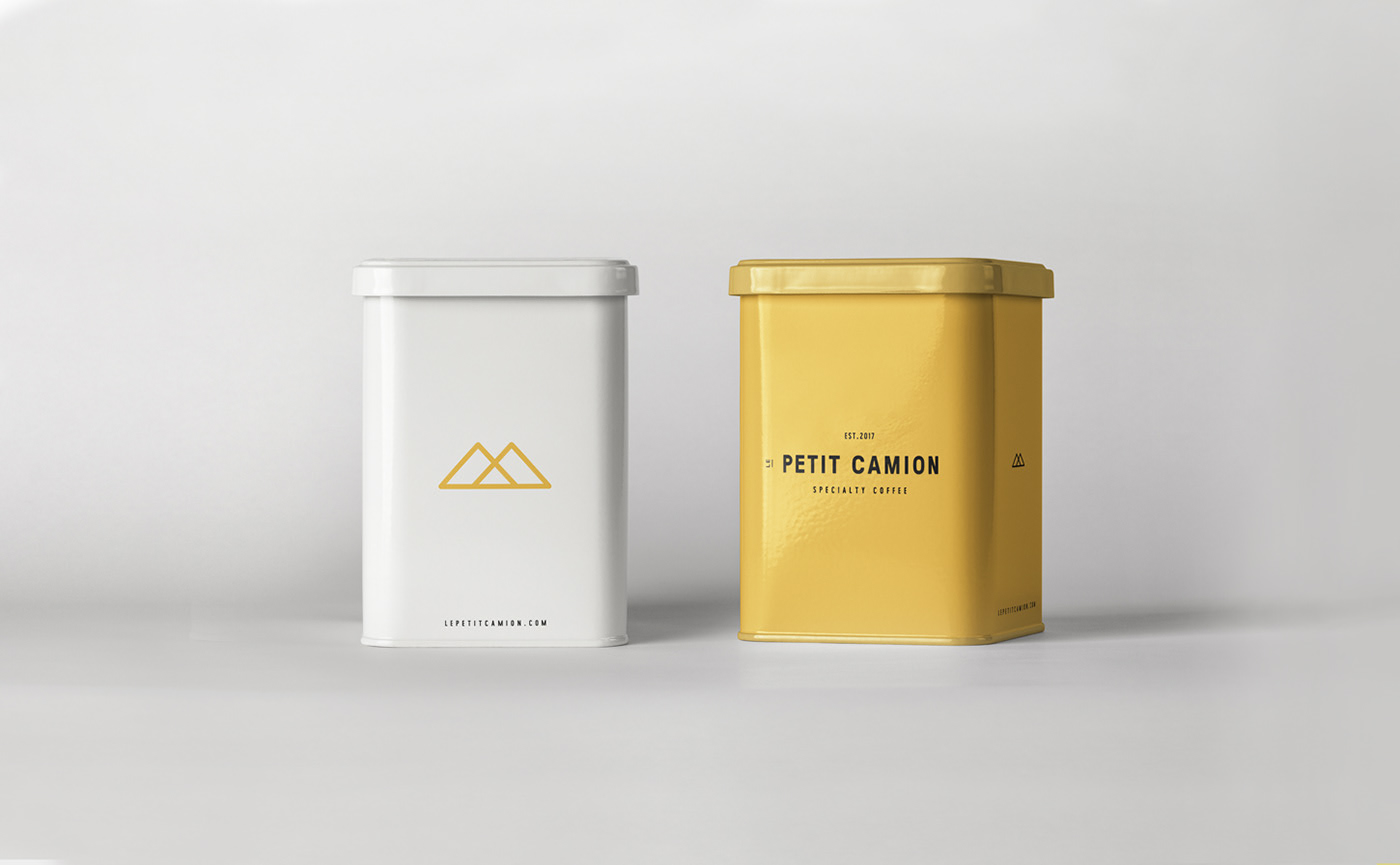
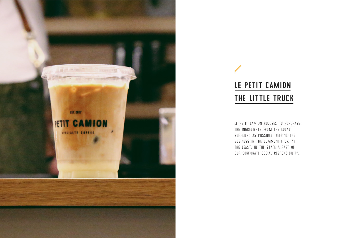
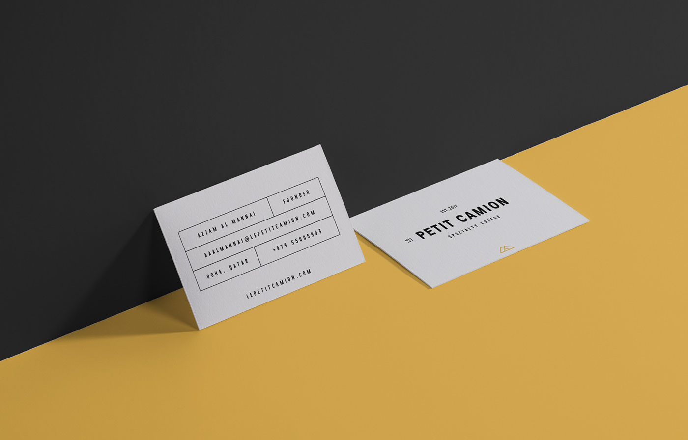
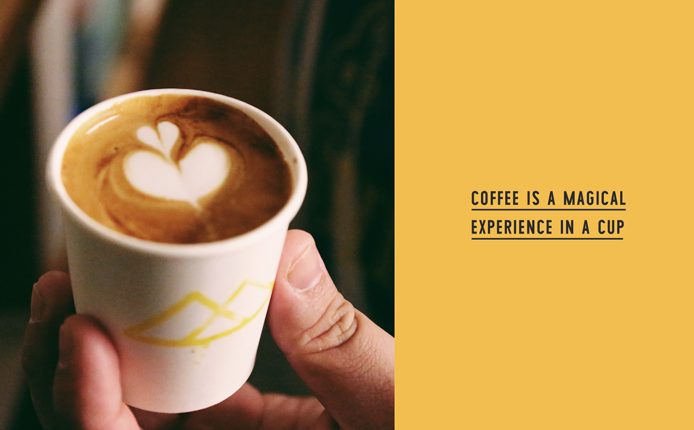
Serving specialty coffee coffee and introducing high-end coffee in the Qatari Market tasters and lovers are now able to try LPC different blends. For the brand design, our goal was to design a clean with a mix of vintage and hipster look branding approach. The typography that makes up the core logotype is bold and confident but contains subtle quirks and imperfections that hint at the unconventional nature of the venue.
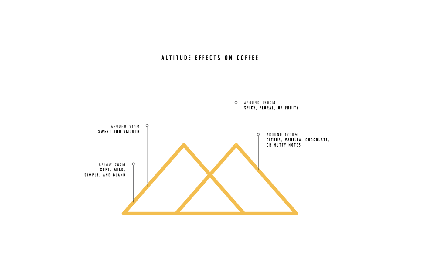
The numerous brand marques also feature different takes on the ‘Est. 2017’ date which will thoroughly reinforce the brand launch. As all the coffees provide from different regions and altitudes, the symbol shapes a horizon of mountains (inspired in the front van grille), representing the different altitudes of coffee productions necessary to create the growing conditions to have dense, tasty and desirable beans.