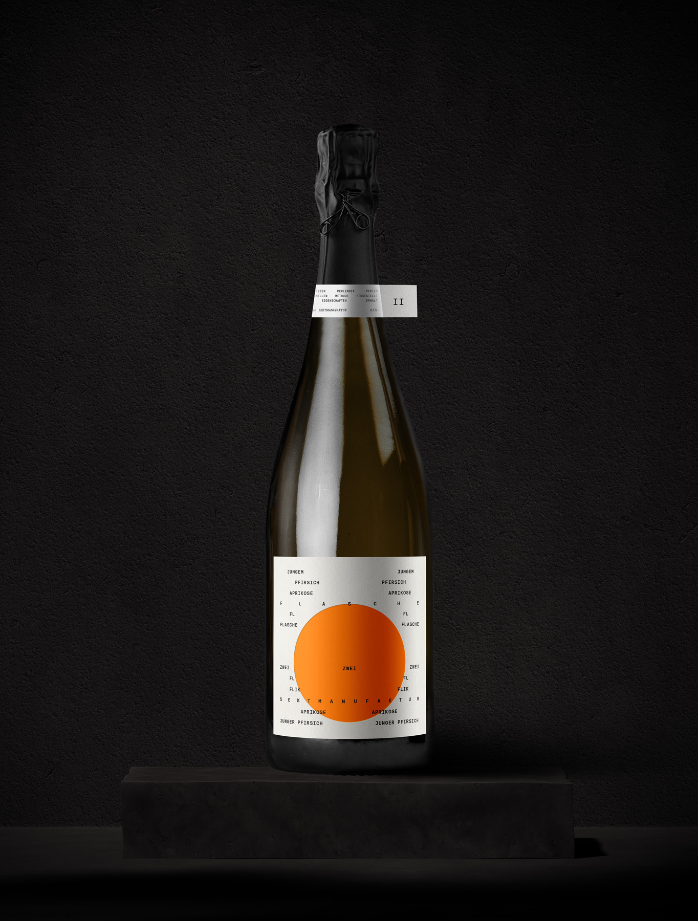
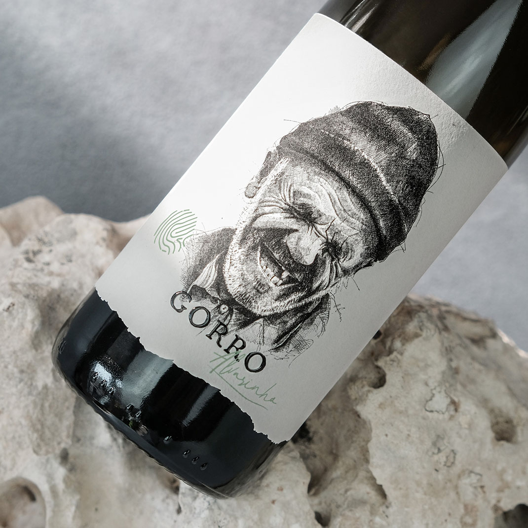
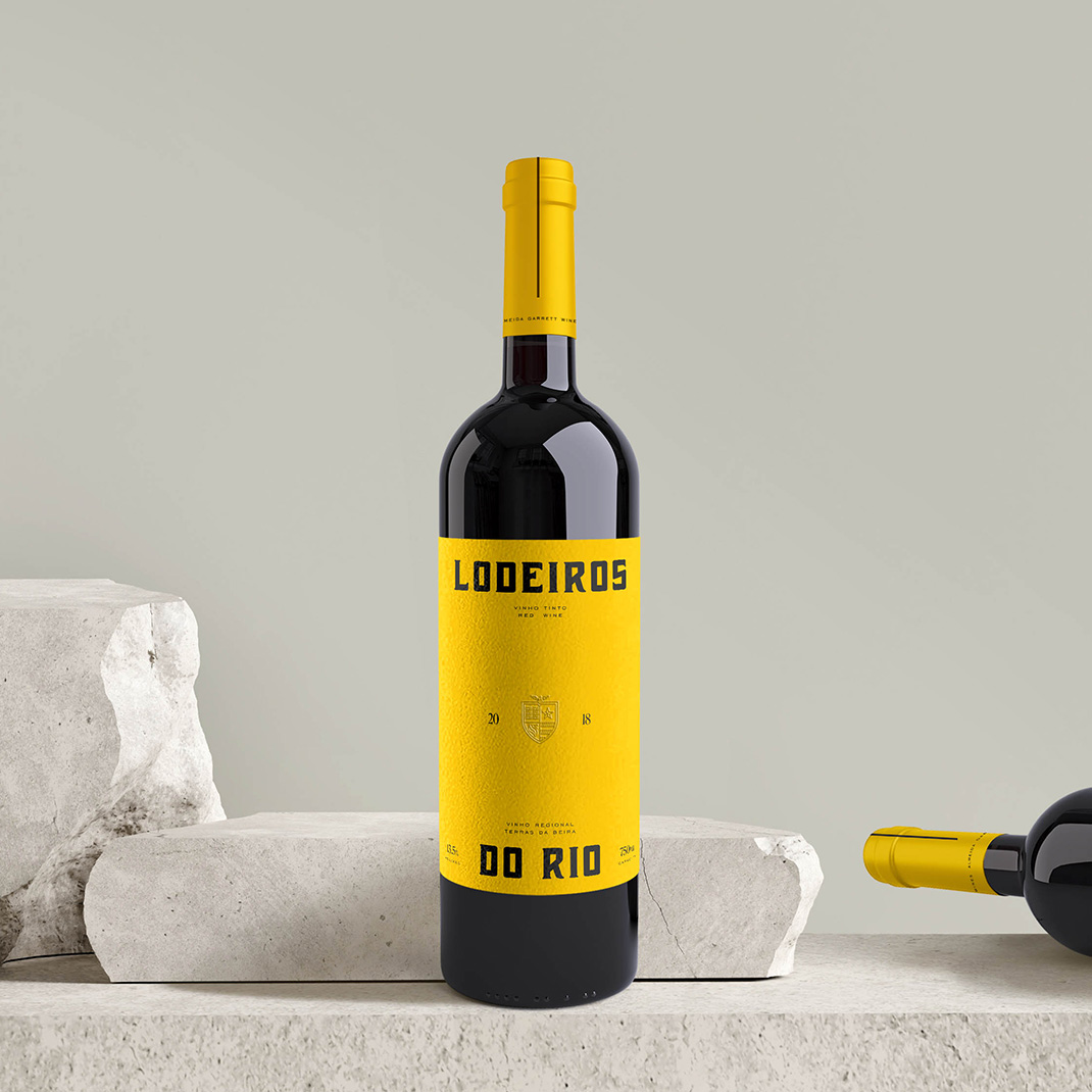
Project. Flik Collection
Client. Flik
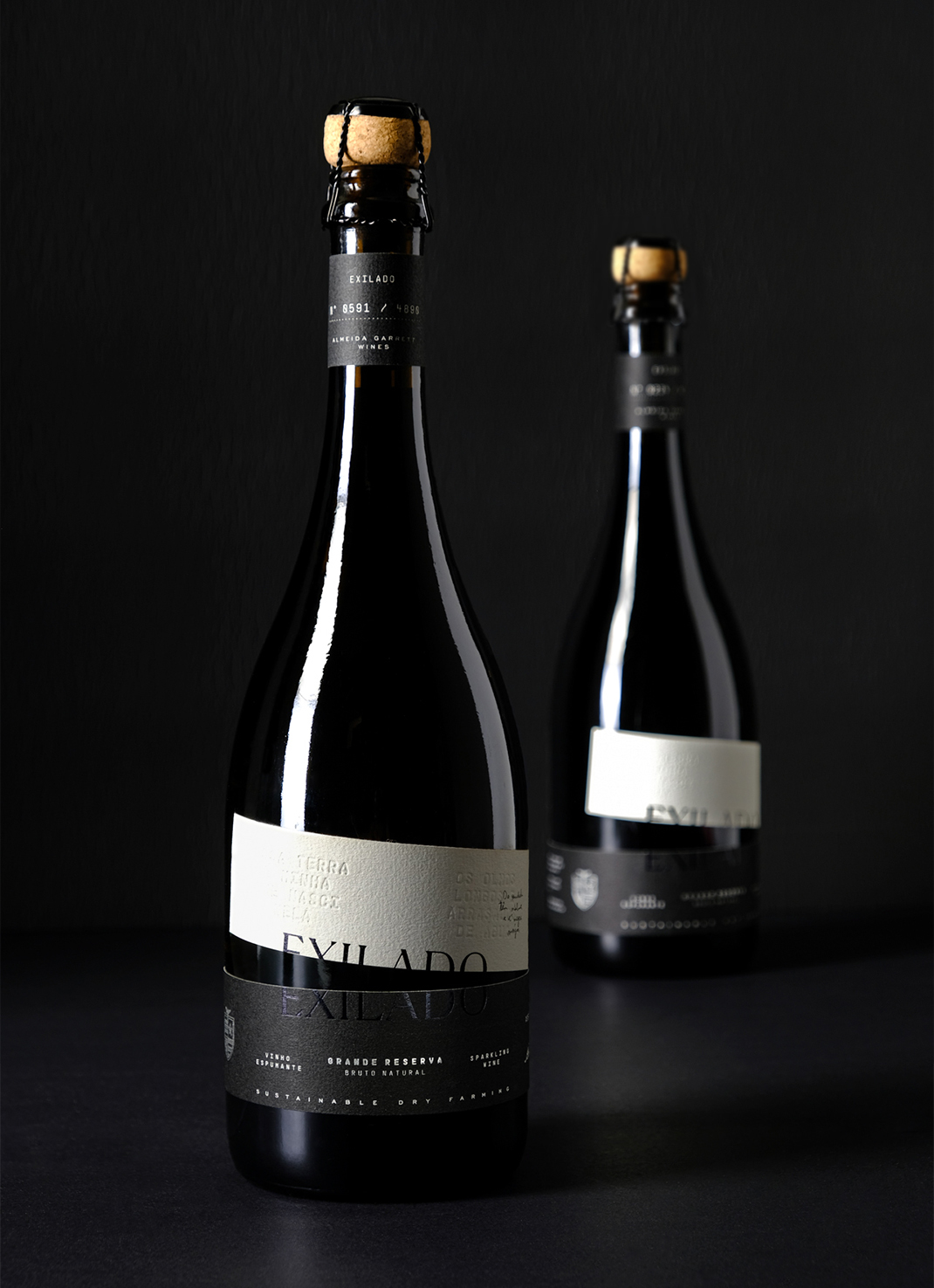
Abstract text forms that spoke to the essence of each wine.
Identity + Packaging
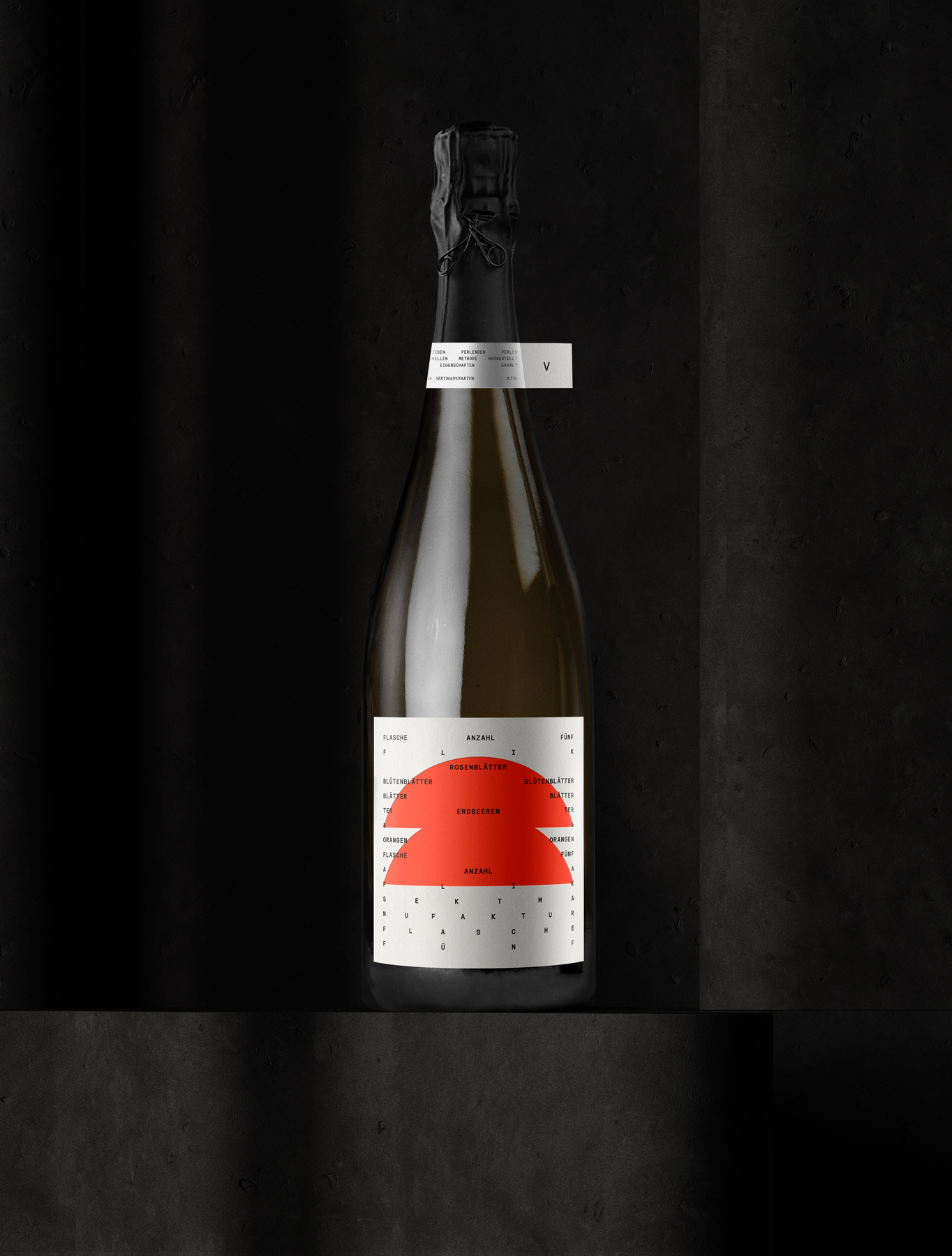
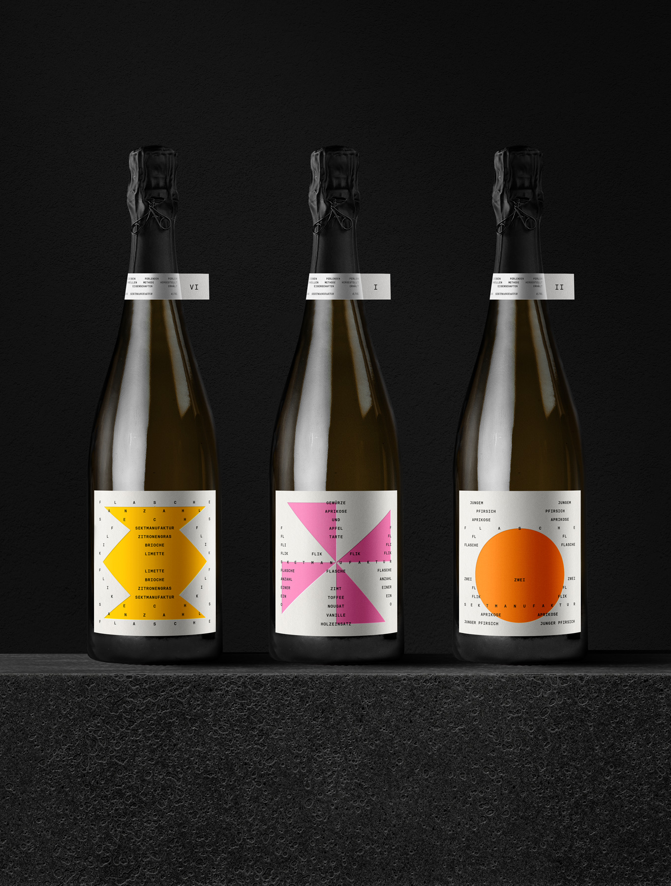
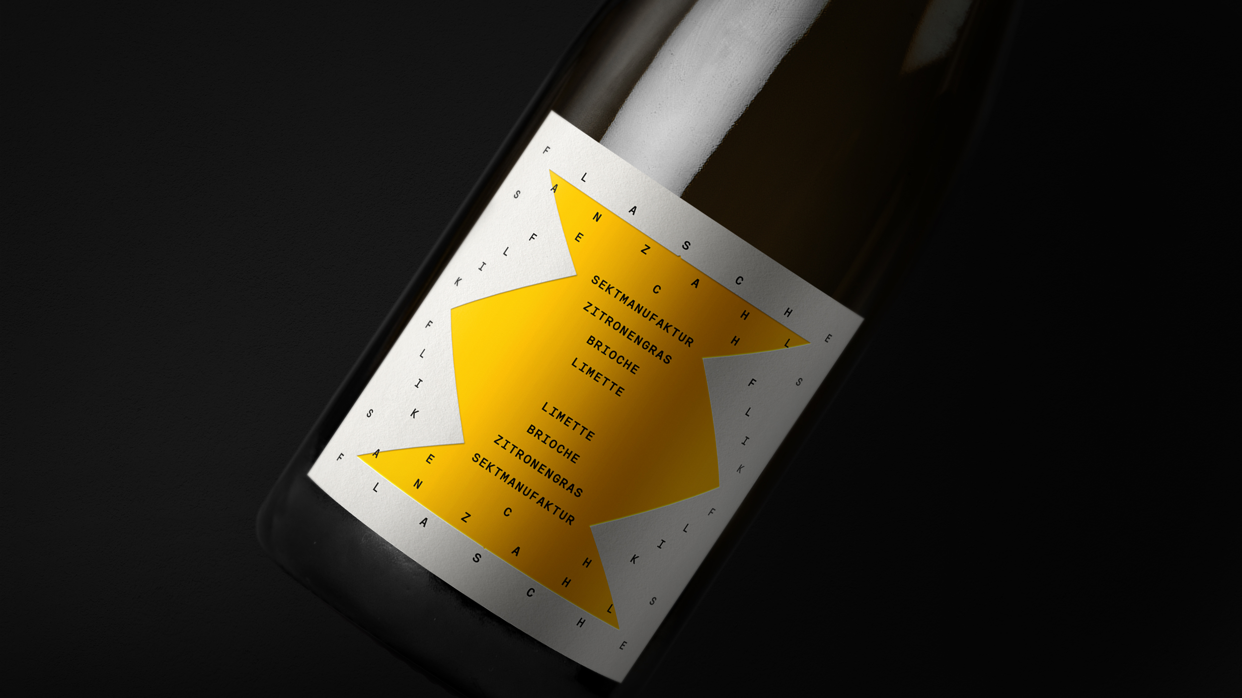
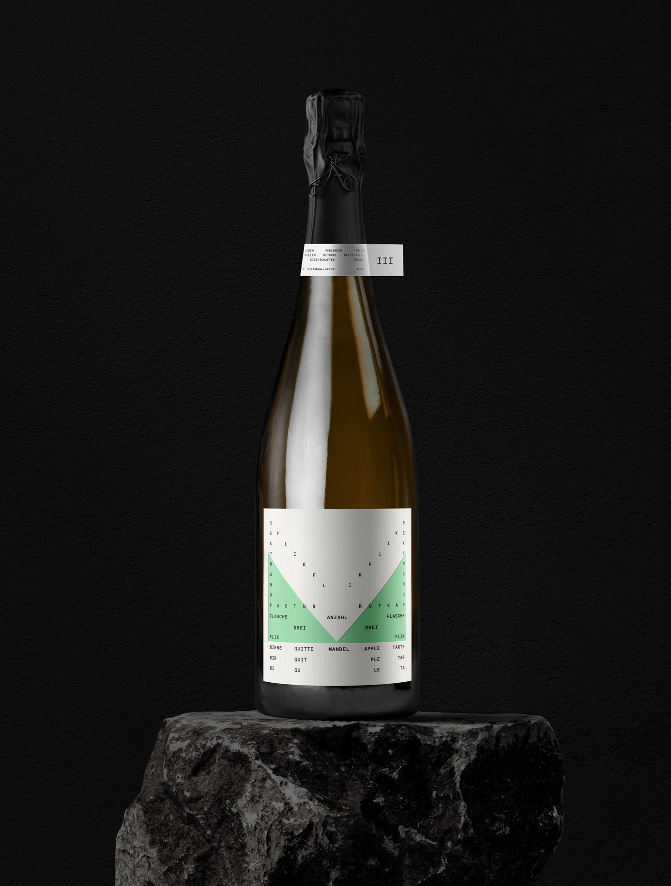
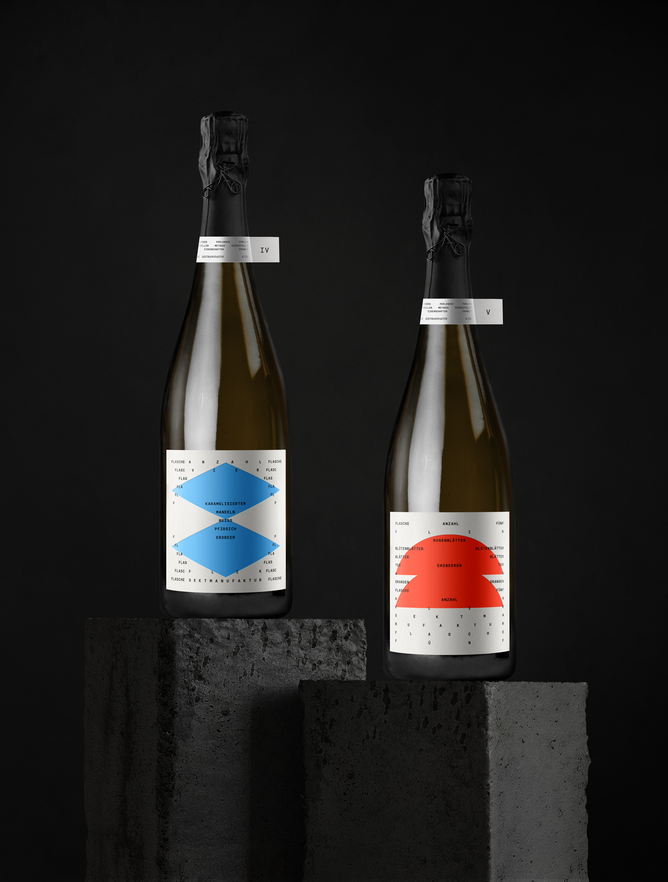
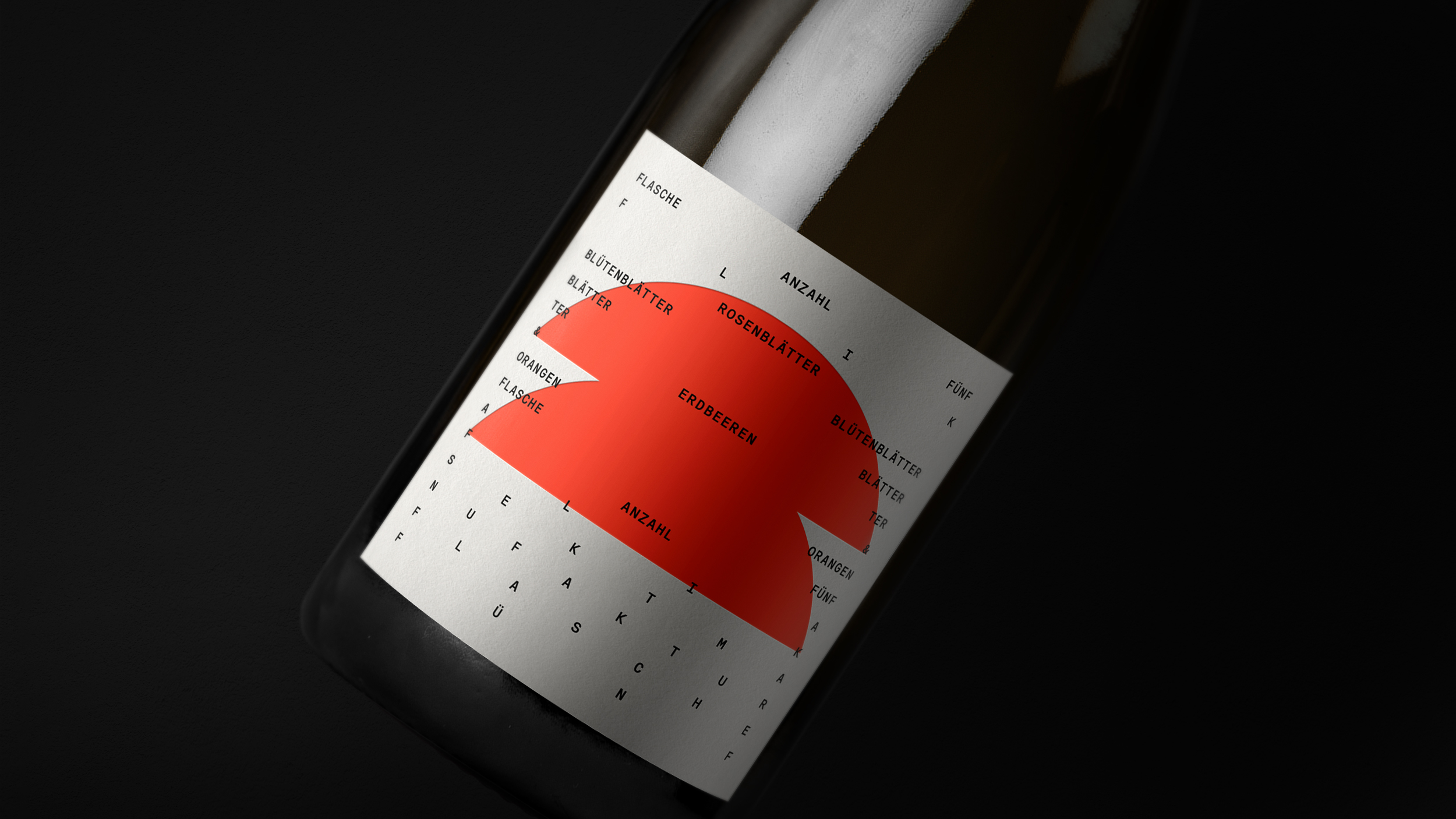
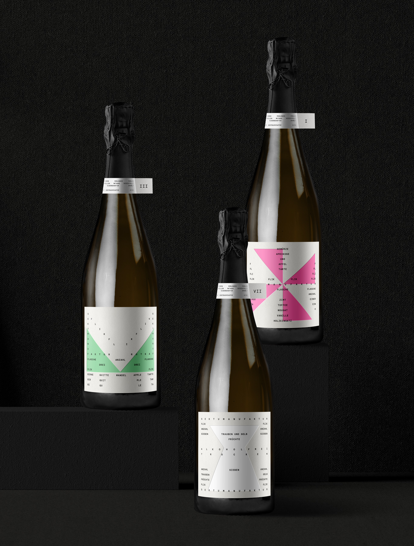
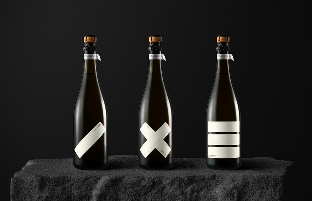
In our rebranding endeavor for a collection of 7 sparkling wines lacking cohesion beyond a shared brand symbol, our goal was clear: transform it into a cherished love brand, unique and memorable.
Through meticulous exploration of details, we delved into visual poetry. This method, known for its ability to engage the reader at a sensorial level, allowed us to merge typography with words, crafting abstract forms that spoke to the essence of each wine. Seven distinct patterns emerged, each reflecting the specifications of its respective bottle and brand. Vibrant geometric shapes, adorned with vibrant colors, complemented our typographic scheme, ensuring individuality while maintaining brand coherence. To heighten the sensory experience, these shapes were delicately debossed with coloured matte foil upon rough paper. — rejected project —